Kitopi
End-to-end design of a cloud kitchen food delivery app
Overview
CLIENT:
Kitopi
TEAM:
Sr UX designer
UX designer / researcher
UI designer
MY ROLE:
UX designer / researcher
DURATION:
4 months
Role
I was one of the UX designers assigned to this project - working alongside Jessica Massinelli, the Sr. UX designer at the time, as well as Darryn Kings, the UI designer.
I also conducted the usability testing with the users, analyzed results, and made recommendations & iterations to the design.
Kitopi is currently the Middle East’s largest managed cloud kitchen platform and is the MENA region’s third unicorn, valued at over $1bn. Prior to our work with them, they did not have a standalone meal delivery app for Kitopi customers to order from - instead, users had to order either directly from the Kitopi website or via third-party food aggregator apps such as Deliveroo or Talabat.
It took a full-stack team of UX designers, researchers, and UI designers, to collaborate on this project over the span of 4 months, starting from focus group discussions for pain point definition and concept validation to usability testing of the final high-fidelity prototype. Weekly collaborations and touchpoints with the Kitopi clients ensured business goals were met throughout the design and testing process.
Challenge
The objective was to design an end-to-end food app, but unique to other food aggregators with notable USP’s. Given Kitopi’s flexibility as a cloud kitchen, they wanted to be able to provide users with the unique control of ordering from multiple “restaurants” at the same time as well as having a fully personalised food app experience.
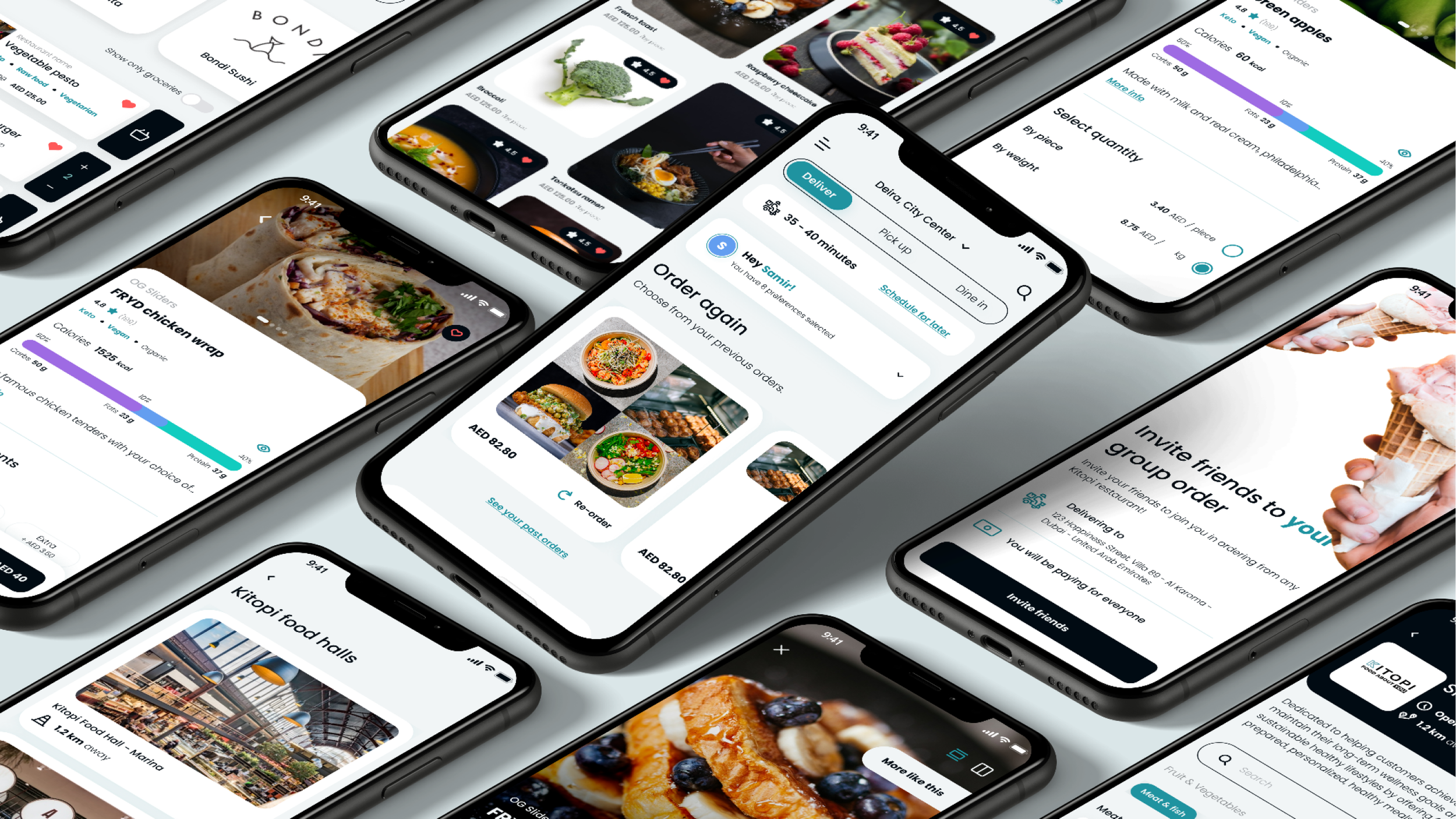
We were responsible for design of the end-to-end food delivery app - we were able to create a customer-centric product strategy and roadmap with unique features such as shared carts, dietary requirement consideration, and the inclusion of a ‘food wall’ for inspiration.
Over 300 wireframe screens, dozens of standup meetings, and 1000+ man hours later, we designed something we are immensely proud of!
Methodologies:
I. Kickoff meeting & stakeholder workshop
In this discovery phase and the kickoff of the project, our goal was to understand the business requirements, the users, and the technology and ensure that we align with expectations.
The outcome of the workshop was to:
On-board everyone on the full spectrum of the project
Agree upon communication and collaboration strategies
Become aware of business goals and product vision
Understand the brand guidelines
Gather inspiration and a list of competitors to drive design direction
Discuss assumptions to validate and improve all users journeys
Understand all technology requirements and limitations
Gather insights on the planned content and features for all platforms
Establish success criteria and project goals to measure success
II. Stakeholder survey
To ensure alignment to business needs and post-Kickoff Meeting, a stakeholder survey was created and distributed to align on app purposes, brand attributes, target audience, key tasks, and success factors. These insights would give us further validation on the clients’ business needs and help us ensure alignment with future designs.
III. Focus group discussions
Focus groups revealed key insights for defining the future product, such as preferences, pain points, food decision-making, and insights into factors that would make users switch from one food app to another.
IV. Competitive analysis
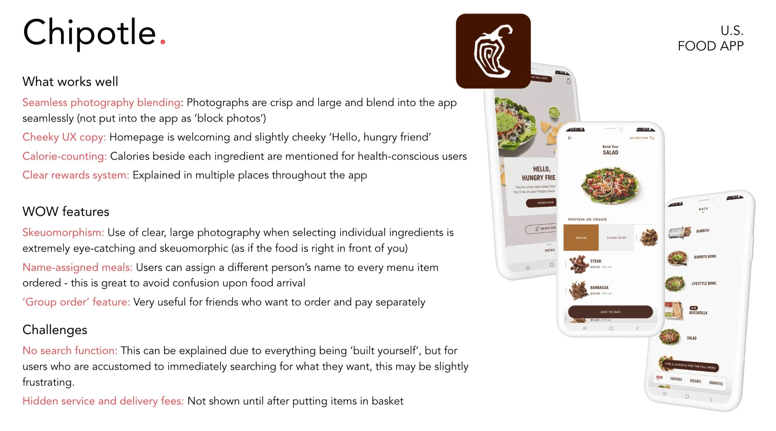
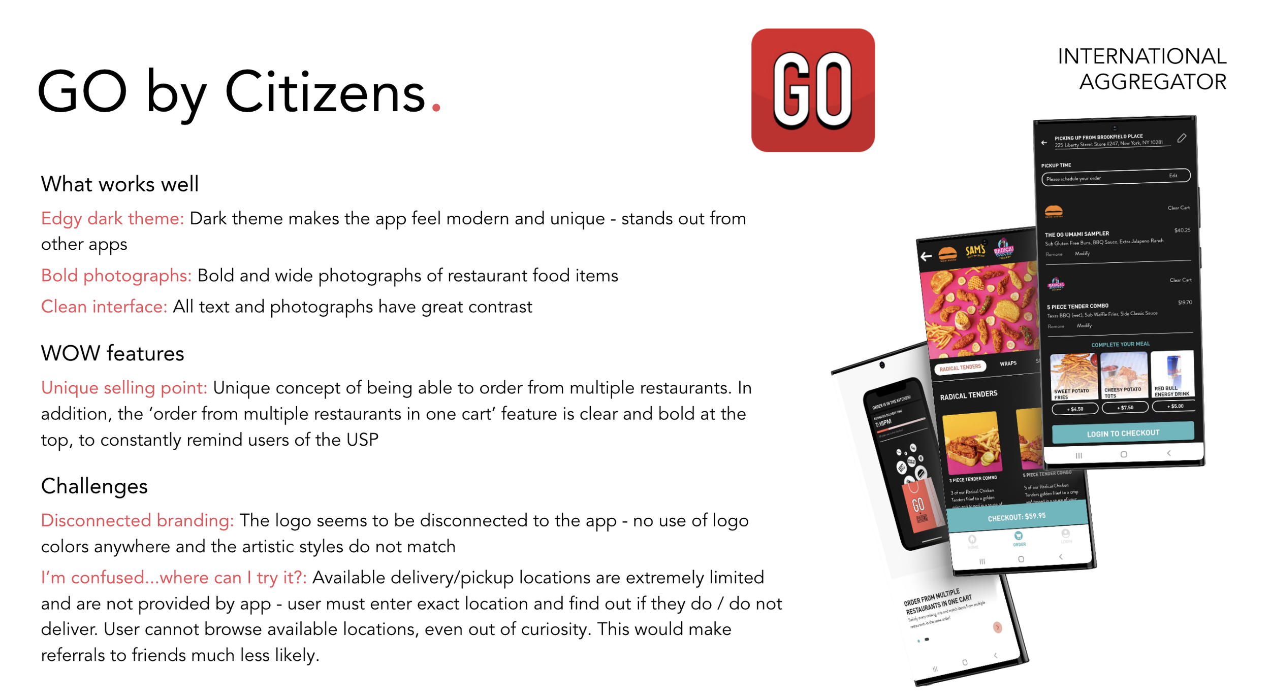
Given that Kitopi wanted to stray away from the ‘aggregator’ perspective, there were no truly direct competitors for analysis, and instead we selected 10 competitors - either from food industries or other retail industries - to better understand the competitive landscaping and essential features provided to users. We wanted to understand what works well, their ‘wow’ features, as well as obvious challenges or pain points.
V. Feature Roadmap & Information Architecture
Based on all the user research and competitor analysis, we created a feature roadmap that prioritised certain MVP features over another based on impact and effort. However, we also needed to understand commercial needs as well as technical feasibility - in collaboration with Kitopi, we came out with a distinct feature list to work through.
Once we knew and sorted through the must-have (MVP) features, we dove into creating information architecture for the app - which helped us better understand the app’s basic initial ‘skeleton’ and infrastructure.
Unique features
Onboarding: Spotify-like "what do you prefer/like", for food dishes
Food recommendations based on time of day (breakfast, lunch, dinner, snacks)
Schedule: order for later or ahead of time (up to 1 week)
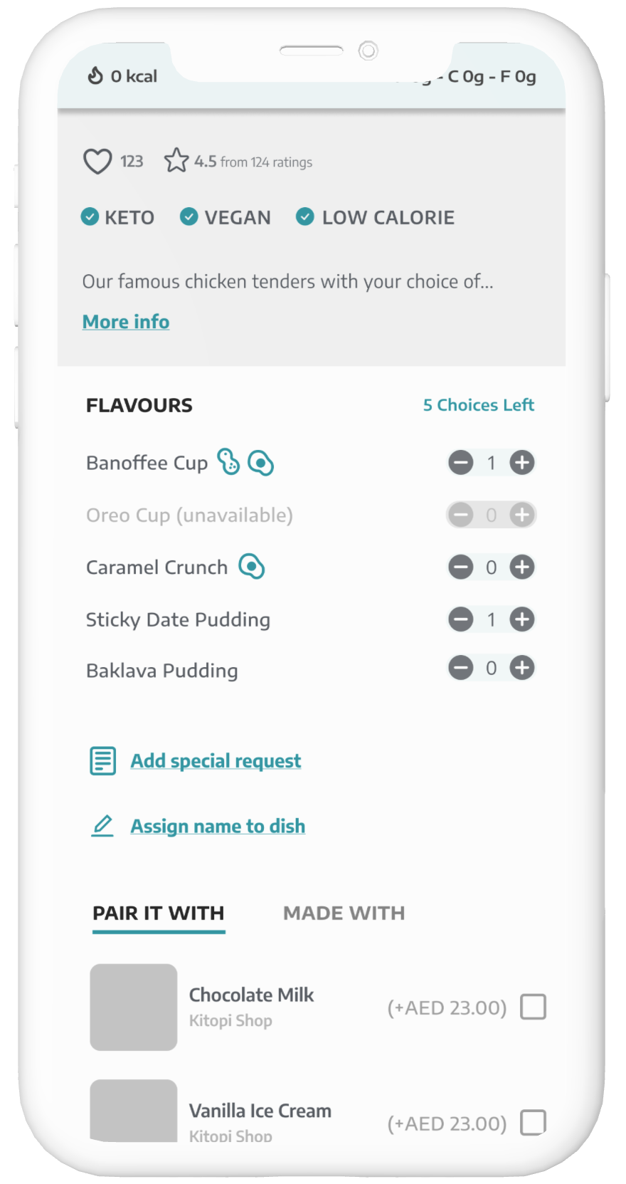
Nutritional information (calories, macros)
Intolerances / allergen information visible
Select variation for the dish
Choose variety boxes or ingredients (eg. donuts)
Adjust food portions / dish size BYO (create dish from scratch)
Dynamic calorie / macro changes to item as user customizes ingredients
Dynamic avoidance information as user goes through BYO / customization process
Shared cart between users (like uber) for group orders
VI. Flow & Wireframes
Once the overall infrastructure was complete, we began work on flows and wireframes split into 4 batches, over 4 weeks. Each week there would be a catch-up meeting with the client, discussing what had been designed and why, and ensuring overall alignment with what was being produced.
VII. Design Direction & UI Design
After presenting the client with multiple design directions, they ultimately decided on a minimal, teal-black colour scheme. Once approved, our UI specialist converted the grayscale wireframes into high-fidelity ones. At this stage, the client was able to truly see their product come to life.
A short clip of our prototype
VIII. Usability Testing & Iterations
Once the UI designs were completed - it was time to test! By creating a prototype, the objective of usability testing was to validate the flow for ordering, get feedback on UX of the homepage (ensure delight), and identify areas of friction which could be iterated for further improvement.
We used our in-lab eye tracking & facial tracking device to conduct the sessions
Once completed, the key findings were played back to the Kitopi team where we presented the issues as well as recommendations.
“I love the calories showing here. It’s very unique.“
Wait… I’m confused. I have to pay for them [my friends]? Really?
Removing explanatory paragraph to short ‘consumable’ bites + iconography
Users were frustrated and confused by the large paragraph of text when inviting friends to join the order. By explicitly stating that it was a group order while highlighting key points of the group order with iconography and minimal text, we were able to resolve this issue.
Changing the visual representation of the Food Wall introduction
The Food Wall introduction confused users because they assumed the content was repeated and scrollable. Putting the content into mock-up screens and providing users with the choice to view the Food Wall gave users more control, clarity, and flexibility.
Moving calories + macros to the top, to increase user delight
During UT’s, many users were delighted with the ability to view calories and macros - we moved calories + macros to the top of the dietary preference list while expanding them visually so that it did not get lost within the design.
Click below to play with the final prototype!
(desktop only - press f for full screen)
Final Thoughts
This was the truly first B2C “cloud kitchen” app - unique to its regular food delivery competitors, giving the users full control & customisation of the app. It was quite a complex project, with a lot of collaboration required needed between us and the Kitopi product team.
If given the opportunity, I would have loved to do further usability testing on the updated changes to the platforms, and see how the user experience could be even further improved.


